Are you an artist struggling to match the right colours for your artwork? Look no further! Understanding colour theory is essential for every artist, whether beginner or experienced. From complementary colours to monochromatic schemes, there are countless options when it comes to mixing and matching hues. In this blog post, we’ll cover everything you need to know about arts colour matchings and how to make the most of them in your art. Get ready to take your artwork from good to great with these simple tips on mastering colour combinations!
The basics of colour theory
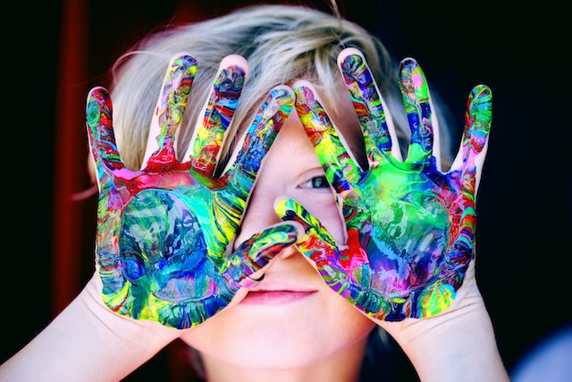
Colour theory is the foundation of every artwork, as it determines which hues and shades work together harmoniously. To put it simply, colour theory is the study of how colours interact with each other. It involves understanding concepts such as hue, saturation, brightness or value.
One essential concept in colour theory is the colour wheel. The primary colours are red, blue, and yellow – they cannot be created by mixing any other colours together. Secondary colours are green (mixing yellow and blue), orange (mixing red and yellow) and purple (mixing blue and red).
Complementary colours refer to those that sit opposite each other on the colour wheel – for instance, green pairs well with magenta. Analogous colours are next to each other on the colour wheel like blue-green or green-yellow; these combinations create a more tranquil effect than complementary ones.
Colour temperature plays an important role too: warm colours include oranges/yellows while cool tones include blues/greens/purples – this can impact moods differently in artworks depending on what you want to express.
By mastering these basics of color theory – artists will have a firm grasp of creating stunning artworks through matching colors effectively!
How to match colours in your art
Matching colours in your art is an essential part of creating a cohesive and visually pleasing piece. Here are some tips to help you match colours effectively:
First, start with the basics: understanding colour theory. Knowing the primary, secondary and tertiary colours can help you create harmonious combinations.
Next, consider the mood or emotion you want to convey through your art. Warm tones like reds, oranges and yellows evoke energy while cool tones like blues and greens create a calming effect.
When choosing colours, look for complementary hues that will enhance each other rather than clash. A popular method is using a colour wheel as a reference guide to determine which shades work well together.
Don’t be afraid to experiment with different combinations until you find what works best for your artwork. And remember that sometimes less is more – incorporating too many colours can overwhelm the piece.
Pay attention to lighting conditions when matching colours in your art- certain shades may appear differently under natural daylight versus artificial light sources.
By following these tips and experimenting along the way, and by visiting justresin online store you’ll be on your way towards mastering the art of colour matching!
The different types of colour schemes
When it comes to colour schemes, there are various options that artists can choose from. One popular type of scheme is the monochromatic colour scheme. This involves using shades and tints of one particular hue to create a cohesive piece. For example, an artist may use different shades of blue in their artwork.
Another option is the complementary colour scheme which involves pairing colours that are opposite each other on the colour wheel such as red and green or orange and blue. The contrast created by these colours makes for a visually striking piece.
Analogous colour schemes involve using colours that sit next to each other on the colour wheel such as yellow, orange and red or purple, blue and green. These combinations tend to be harmonious but can lack contrast if not executed correctly.
Triadic colour schemes utilise three colours spaced evenly apart on the color wheel such as purple, yellow, and green or red, blue, and yellow. These types of schemes offer both harmony and visual interest when used effectively.
Ultimately, choosing a colour scheme depends heavily on personal preference but understanding these different types is important for creating impactful art pieces.
How to use colour in your art
By now, you should have a good understanding of colour theory and how to match colours in your art. But what about actually using colour in your artwork?
There are many ways to use colour effectively in your art. You can use it to convey emotion, create contrast or harmony, and even lead the viewer’s eye through the piece.
One important thing to consider is the mood that you want to evoke with your artwork. Warm colours like reds and yellows can create a sense of energy and excitement, while cooler colours like blues and greens can be calming and soothing.
Another technique is using complementary colours, which are opposite each other on the colour wheel (e.g., purple and yellow). These combinations create high contrast and visual interest.
You can also play with saturation (the intensity of a colour) by using muted or desaturated tones for a more subdued effect or bright saturated tones for bold impact.
In summary, there are endless possibilities when it comes to using colour in your art. Experimentation is key – try different techniques until you find what works best for your style!


