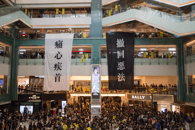
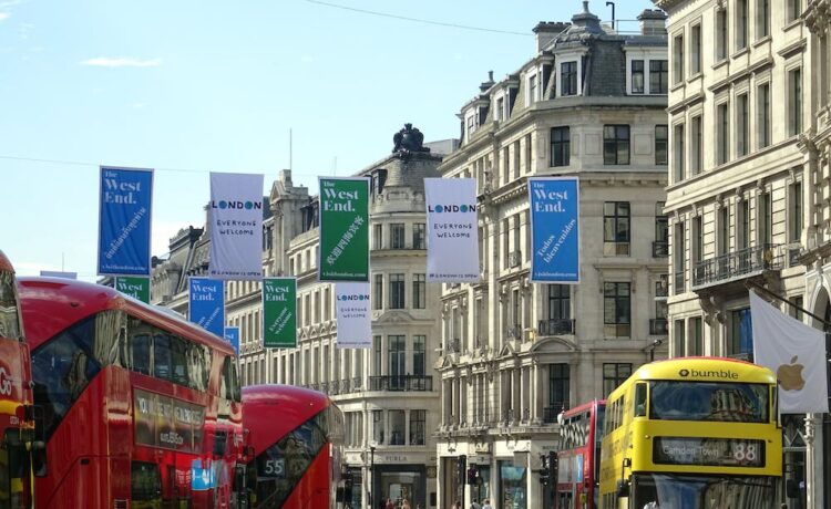
Outdoor vinyl banners are a great way to promote events, sales, businesses etc. to a wider audience. You can have them displayed at storefronts, community events, trade shows, outdoor gatherings etc. and to ensure that they catch the attention of passers-by, you need to have a good design so that your message is clearly conveyed.

You need to first think about what you are having a banner
And what you hope to achieve with this. Maybe you are planning to announce a sale or promote a specific event. They can also be used to increase brand visibility. If you have multiple goals, you can decide the level of priority for each. Once you understand the objective, you can help decide the direction to take when it comes to the design. You have to understand your audience as this will have a big impact on what design elements and imagery are used along with the style of messaging. You have to consider the demographics and the preferences of the audience so that you have a higher chance of capturing their attention. There are also so many different sizes and orientations to outdoor banners so you need to decide what is suitable for your purposes. You have to consider the viewing distance for the banner and available space. There are also environmental conditions to be considered when ensuring readability of the banner.
It is important to select high quality graphics and images
When you use high resolution images, it will increase the sharpness and clarity of the banner design. So you always need to check whether there is enough resolution when it comes to large format printing as low resolution can lead to distortion or pixilation. You also need to keep it simple when it comes to the design. Think about how the main message can be conveyed clearly and in a concise way. To do this, you have to use minimal text. When there is a lot of text in the banner, people will not take the time to read it. The message should be apparent within seconds of viewing the banner. And you have to be careful in choosing the images as the visuals should be impactful in order to grab the attention of a passer-by in a busy street or in a crowded trade show. Your key points should be communicated quickly and clearly to the viewer.

There should be legible fonts and colours so that the banner can be read from a distance
You have to avoid the use of overly decorative styles. High contrast colours will stand out against the background increasing readability in a variety of lighting conditions. There has to be consistency with your brand identity in the banner design and to ensure this, you have to use the colours, logo and typography that align with the brand guidelines. With consistent branding, you can strengthen brand recognition and credibility so that the effectiveness of the banner is improved.


